Medium: Editorial Poster Design
Theme: South Indian Coffee Culture
Approach: Storytelling Through Nostalgia
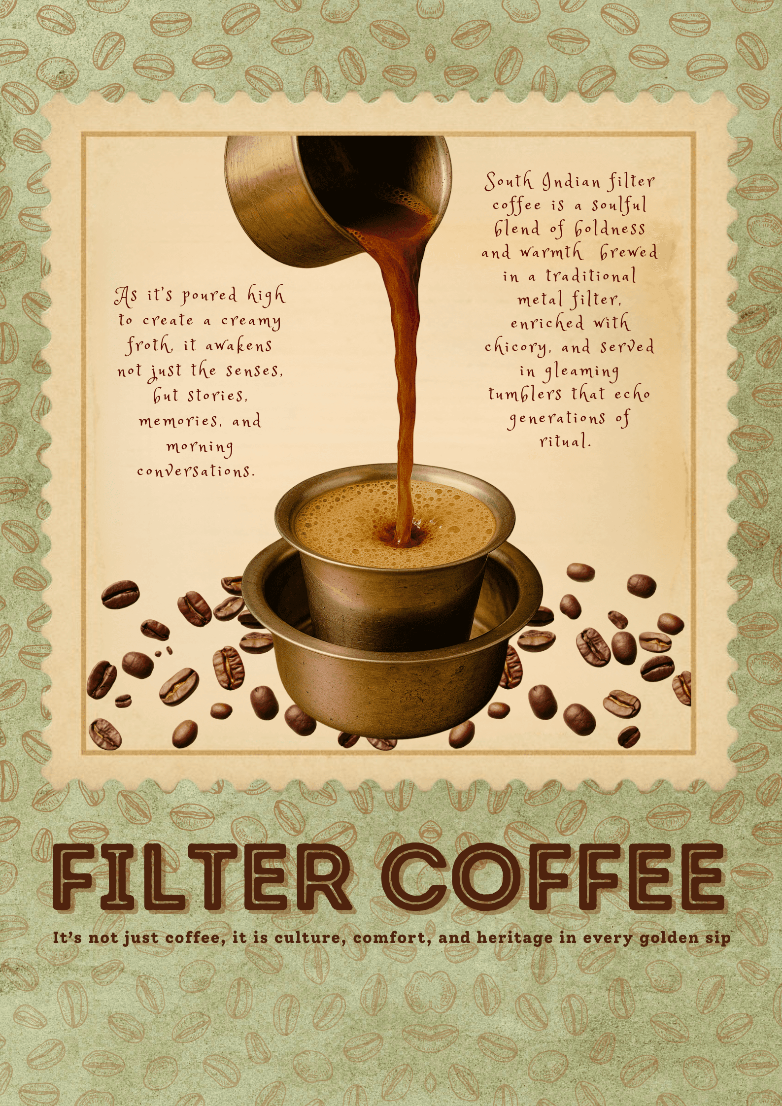
Concept: Filter coffee isn't just a beverage in South India—it's ritual, memory, and intergenerational connection. This poster captures that narrative through vintage aesthetic and evocative copy.
Design Choices:
Vintage frame aesthetic: Coffee bean border + scalloped edges evoke traditional South Indian textiles and rangoli patterns
Warm color palette: Sage green + cream + brown = nostalgic, comforting, heritage
Hand-drawn typography: Personal, warm, non-commercial (vs. sterile modern fonts)
Central visual: Traditional metal filter pouring into tumbler and davara (authentic serving vessels)
Dual narrative copy: Left side = sensory experience ("As it's poured high to create a creamy froth..."); Right side = cultural context ("enriched with chicory, served in gleaming tumblers that echo generations of ritual")
Typography:
Large "FILTER COFFEE" in bold serif = authority, tradition
Handwritten body copy = intimacy, personal story
Tagline: "It's not just coffee, it is culture, comfort, and heritage in every golden sip"
Cultural Authenticity: References traditional South Indian filter coffee preparation method (high pour for froth, chicory blend, metal vessels)
Use Case: Restaurant decor, cultural education materials, food tourism campaigns
Reception: Celebrates heritage without exoticizing; balances nostalgia with modern design
Medium: Food Editorial Poster
Theme: South Indian Culinary Icon
Approach: Educational + Appetizing
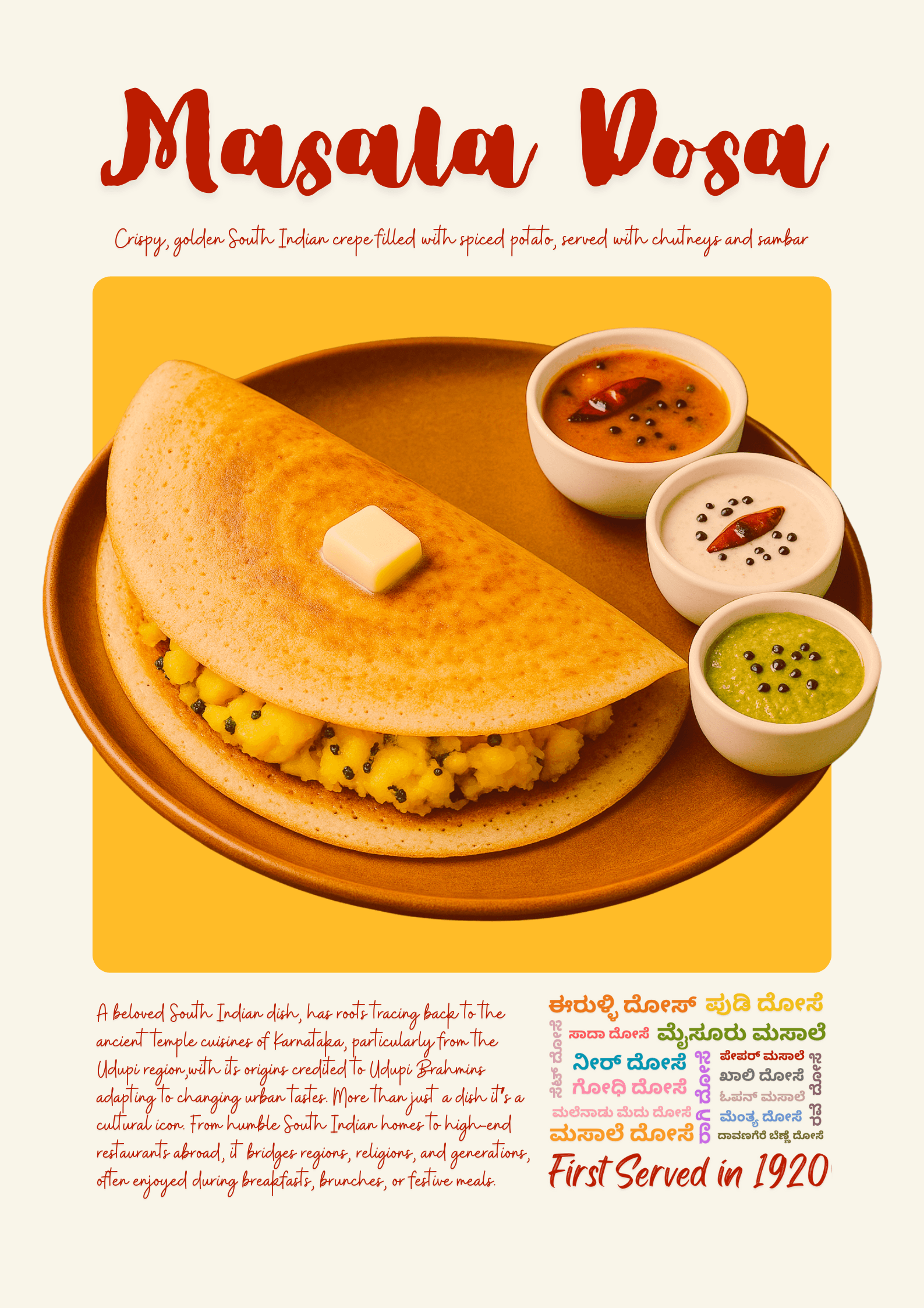
Concept: Celebrating masala dosa as more than street food—tracing its roots to ancient temple cuisines and regional variations across Karnataka.
Design Choices:
Warm beige background: Neutral canvas making food hero
Bold red script typography: "Masala Dosa" in dynamic brush lettering = energy, celebration
Hero product shot: Crispy golden dosa with colorful chutneys (orange, white, green) = visual appetite appeal
Circular composition: Wooden plate creates focal point
Educational copy: Historical context (temple origins, Udupi Brahmins, 1920 first serving)
Multilingual typography: Regional languages (Kannada script) = cultural authenticity
Ingredient description: "Crispy, golden South Indian crepe filled with spiced potato, served with chutneys and sambar"
Typography Hierarchy:
"Masala Dosa" (primary, red, script) = emotional, appetizing
Ingredient description (secondary, script) = informative
Historical context (tertiary, body) = educational depth
"First Served in 1920" (accent, red) = heritage credibility
Cultural Layer: "From humble South Indian homes to high-end restaurants abroad, it bridges regions, religions, and generations"
Use Case: Restaurant decor, cultural education materials, food tourism campaigns
Reception: Celebrates heritage without exoticizing; balances nostalgia with modern design
Medium: Menu / Campaign Poster
Theme: Indian Dessert Celebration
Approach: Modern Maximalism
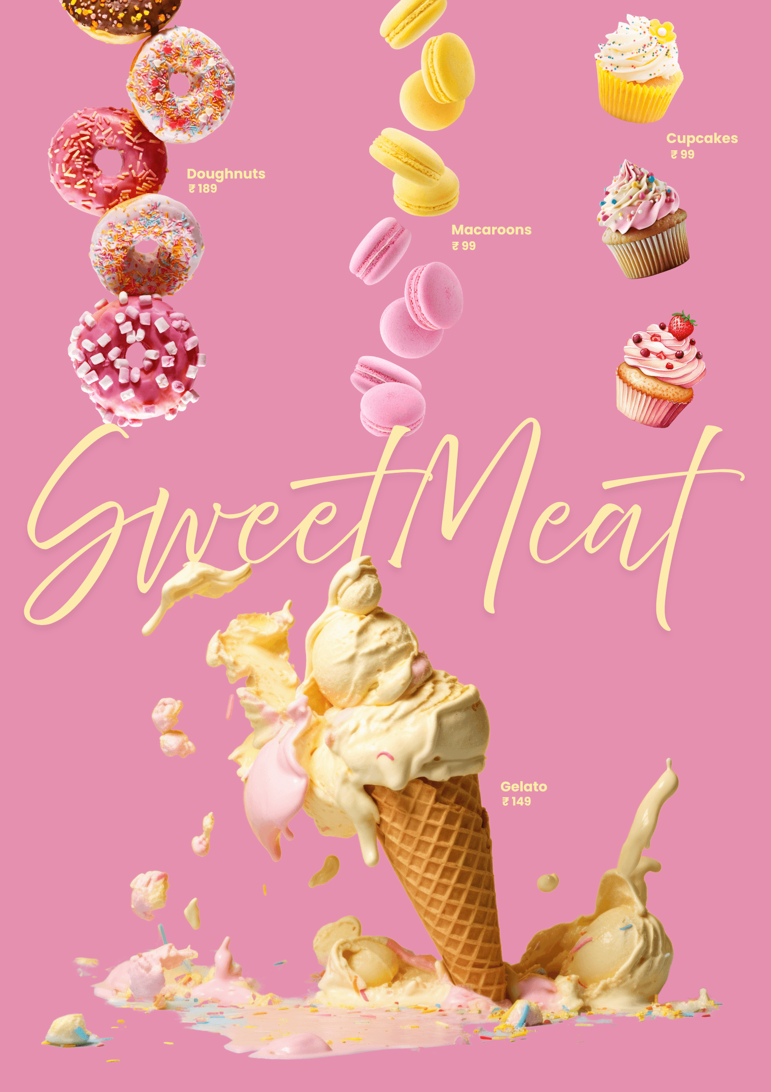
Concept: Joyful, indulgent, over-the-top celebration of Indian sweets with Western desserts—breaking the minimalism trend with deliberate abundance.
Design Choices:
Hot pink background: Bold, unapologetic, energetic (anti-neutral)
Floating product composition: Doughnuts, macarons, cupcakes, gelato suspended mid-air = whimsy, abundance
Dynamic movement: Items appear to be falling/floating = playful energy
Script typography: "Sweet Meat" in flowing golden script = elegant chaos
Product labels + pricing: Practical menu information integrated into art
Ice cream cone meltdown: Central visual (melting gelato cone) = indulgence, sensory pleasure
Typography:
"Sweet Meat" (golden script, large) = indulgence, celebration
Product names (clean sans-serif, white) = clarity
Pricing (₹99-189) = accessibility
Color Strategy: Pink (energy) + Yellow/Gold (warmth, indulgence) + White (clean product shots) = modern Indian sweet shop aesthetic
Concept Subversion: "Sweet Meat" plays on traditional Indian "mithai" (sweets) concept but features Western desserts—cultural fusion without dilution
Use Case: Dessert shop branding, menu design, social media assets
Approach: Breaks "clean minimal" trend; embraces joyful abundance
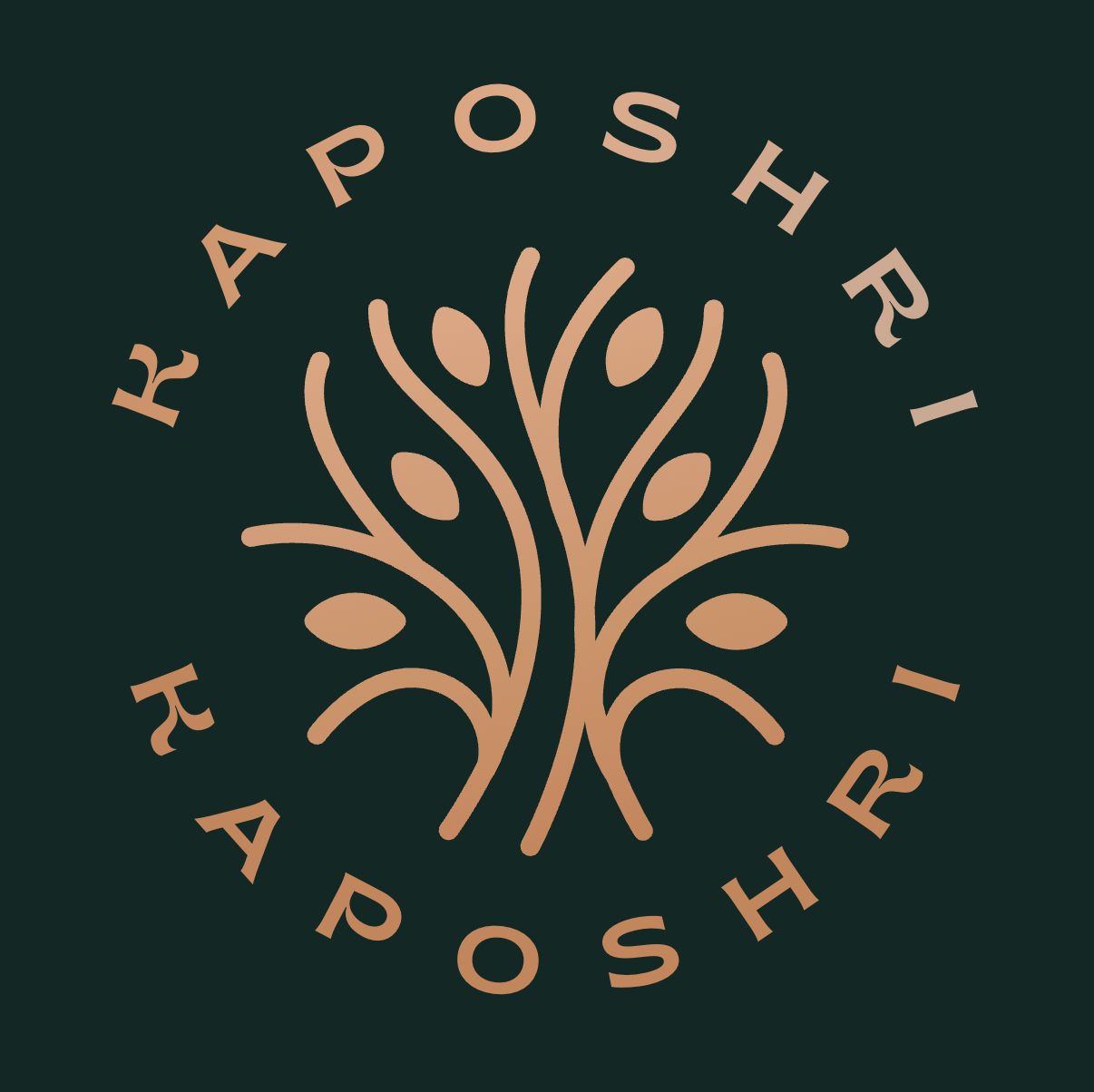
Concept: Artisanal, premium, rooted in tradition
Application: Ayurvedic skincare, handcrafted textiles, heritage hospitality
Design Analysis:
Tree of life symbol: Roots + growth = heritage + future
Copper/rose gold gradient: Premium, warm, traditional metals
Deep emerald background: Luxury, nature, sophistication
Circular containment: Completeness, protection, holistic
Ornate typography: Custom serif with traditional Indian letterform influence
Symmetry: Balance, trustworthiness
Typography: "KAPOSHRI" in custom serif with subtle flare = premium heritage
Brand Personality: Timeless, rooted, premium, artisanal
Use Case: Luxury heritage brands, artisanal products, wellness companies
Approach: Premium positioning through cultural authenticity + modern execution
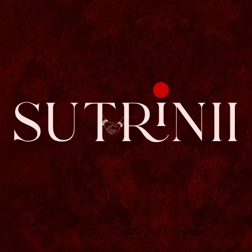
Concept: Sophistication, mystery, craft
Application: Fine dining, jewelry, luxury fashion
Design Analysis:
Deep burgundy background: Rich, mysterious, premium
White serif typography: Clean, elegant, timeless
Custom letterforms: Extended serifs, refined curves
Red dot accent: Bindi-inspired, cultural marker, focal point
Textured background: Subtle pattern suggests craft, heritage
Minimalist approach: Confidence through restraint
Typography: High-contrast serif with custom ligatures
Brand Personality: Refined, mysterious, culturally rooted, premium
Use Case: Luxury heritage brands, artisanal products, wellness companies
Approach: Premium positioning through cultural authenticity + modern execution
Medium: Product Campaign Poster
Theme: Premium Perfume Branding
Approach: Repetition as Luxury Signal
Concept: Parfum as mantra—the repetition of "PARFAM" creates hypnotic brand presence, while delicate cherry blossoms soften the boldness with feminine elegance.
Design Choices:
Deep burgundy background: Luxury, sensuality, premium positioning (classic perfume advertising palette)
Repeated "PARFAM" typography: Bold pink serif creates pattern + brand immersion
Central product shot: Crystal perfume bottle with golden cap = premium, collectible, gift-worthy
Cherry blossom accents: Delicate pink florals weave through typography = femininity, spring, freshness
Typography as pattern: Text functions both as brand name AND decorative element
Product hero moment: Bottle centered, lit dramatically = focal point despite text repetition
Typography:
Large serif "PARFAM" (repeated) = bold, confident, memorable
Pink gradient on letterforms = soft luxury (not harsh commercial)
High contrast with burgundy = readability + drama
Color Palette:
Burgundy (deep red) = luxury, sensuality, premium
Dusty pink typography = feminine, elegant, modern
Golden bottle accent = wealth, quality, heritage
Pink cherry blossoms = natural beauty, ephemeral luxury
Brand Personality: Bold, unapologetic, luxurious, feminine without being delicate
Strategic Positioning: This isn't minimalist perfume branding—it's maximalist confidence. Repetition creates memorability.
Use Case: Perfume advertising, luxury retail, boutique branding
Approach: Bold repetition creates brand immersion; maximalist confidence

Medium: Formal Wedding Invitation Card
Theme: Traditional South Indian Wedding Ceremony
Approach: Elegant, Ornate, Heritage Luxury
Concept: A wedding invitation that balances formality (ceremonial language, ornate borders) with warmth (peacock illustrations, floral elements, readable hierarchy).
Design Choices:
Cream/parchment background: Classic, timeless, formal invitation standard
Ornate pink filigree border: Continuous decorative frame = traditional Indian invitation aesthetic
Peacock corner illustrations: Left and right corners feature detailed peacocks with flowers = symmetry, elegance, Indian cultural symbol
Temple background (faded): Watermarked temple architecture = context without distraction
Blue typography: Navy/royal blue for names and key info = trust, tradition, formality
Script + serif mix: "Anjana" and "Shreyas" in flowing script (personal), supporting text in elegant serif (formal)
Ceremony timeline with icons: Muhurta (wedding ceremony), Mithuna Lagna (sacred timing), Reception = visual clarity for multi-event day
Venue information emphasized: "The New Castle, Hunsur Road, Mysore" = clear, prominent, essential
Typography Hierarchy:
Names ("Anjana & Shreyas") - Large flowing script, blue = personal, romantic
Date ("20th April 2025") - Bold serif, blue = critical information
Ceremony details - Medium serif with icons = clear, scannable
Venue - Bold serif at bottom = actionable information
Formal invitation text (top) - Small serif, traditional wording
Cultural Elements:
Formal invitation wording: "We solicit your gracious presence on the occasion of the wedding ceremony of..." = traditional Indian invitation language
Parent names included: "(Daughter of R Sandesh & S Sharada)" / "(Son of N A Basavaraju & B M Pramila)" = honoring families, not just couple
Ceremony names in Sanskrit/Kannada: "Muhurta," "Mithuna Lagna" = cultural authenticity
Timeline specificity: South Indian weddings have precise auspicious timings (9:50 am - 10:50 am for Muhurta)
Color Palette:
Cream/ivory (background) = classic elegance
Hot pink (borders, peacocks, accents) = celebration, joy
Royal blue (text, key info) = formality, trust
Gold/beige (temple watermark) = heritage, subtle depth
Iconography:
Traditional Indian ceremonial symbols (wedding pots, flames, hands) = visual clarity for events
Peacocks = grace, beauty, Indian cultural identity
Lotus flowers = purity, new beginnings
Design Balance:
Ornate borders WITHOUT overcrowding center
Multiple events WITH clear visual separation
Cultural depth WITHOUT excluding non-Indian guests (icons + English help orientation)
Brand Personality (for couple): Traditionally rooted, family-oriented, culturally proud, formal but warm, heritage-conscious
Use Case: South Indian wedding stationery, temple wedding ceremonies, cultural celebrations
Approach: Honors tradition (Ganesha, temple architecture, ceremonial language) with modern layout clarity
Reception: Balances ornate decoration with information hierarchy; culturally authentic without overwhelming

Design Software:
Adobe Illustrator (vector logos, typography)
Photoshop (photo manipulation, textures)
InDesign (editorial layouts)
Figma (digital assets, prototyping)
Canva
Typographic Approach:
Custom lettering for unique brand voices
Hierarchy through scale + weight + color
Cultural typography research (Devanagari, regional scripts)
Visual Research:
Indian textile patterns, rangoli geometry
Vintage packaging, traditional signage
Regional color palettes (South Indian temple art, festival aesthetics)
Cultural Storytelling Over Generic Aesthetics
These projects don't just look good—they carry cultural memory. Filter coffee isn't coffee; masala dosa isn't breakfast. They're intergenerational rituals that deserve visual narratives honoring their depth.
Typography as Voice
Each project uses typography to establish tone:
Filter Coffee: Handwritten = intimate, personal
Masala Dosa: Bold script = celebratory, energetic
Sweet Meat: Flowing script = indulgent, playful
Brand marks: Custom serifs = timeless, premium
Color as Cultural Signal
Warm earth tones (Filter Coffee, Masala Dosa) = heritage, comfort
Bold pink (Sweet Meat) = modern Indian aesthetics breaking neutral trends
Deep jewel tones (Kaposhri, Sutrinu) = luxury, tradition
Maximalism When It Serves Story
Not every design needs to be minimal. Sweet Meat's abundance is the point—joy, indulgence, celebration. Restraint would dilute the narrative.
"Good design doesn't just look beautiful—it carries the stories of the people, places, and rituals it represents."